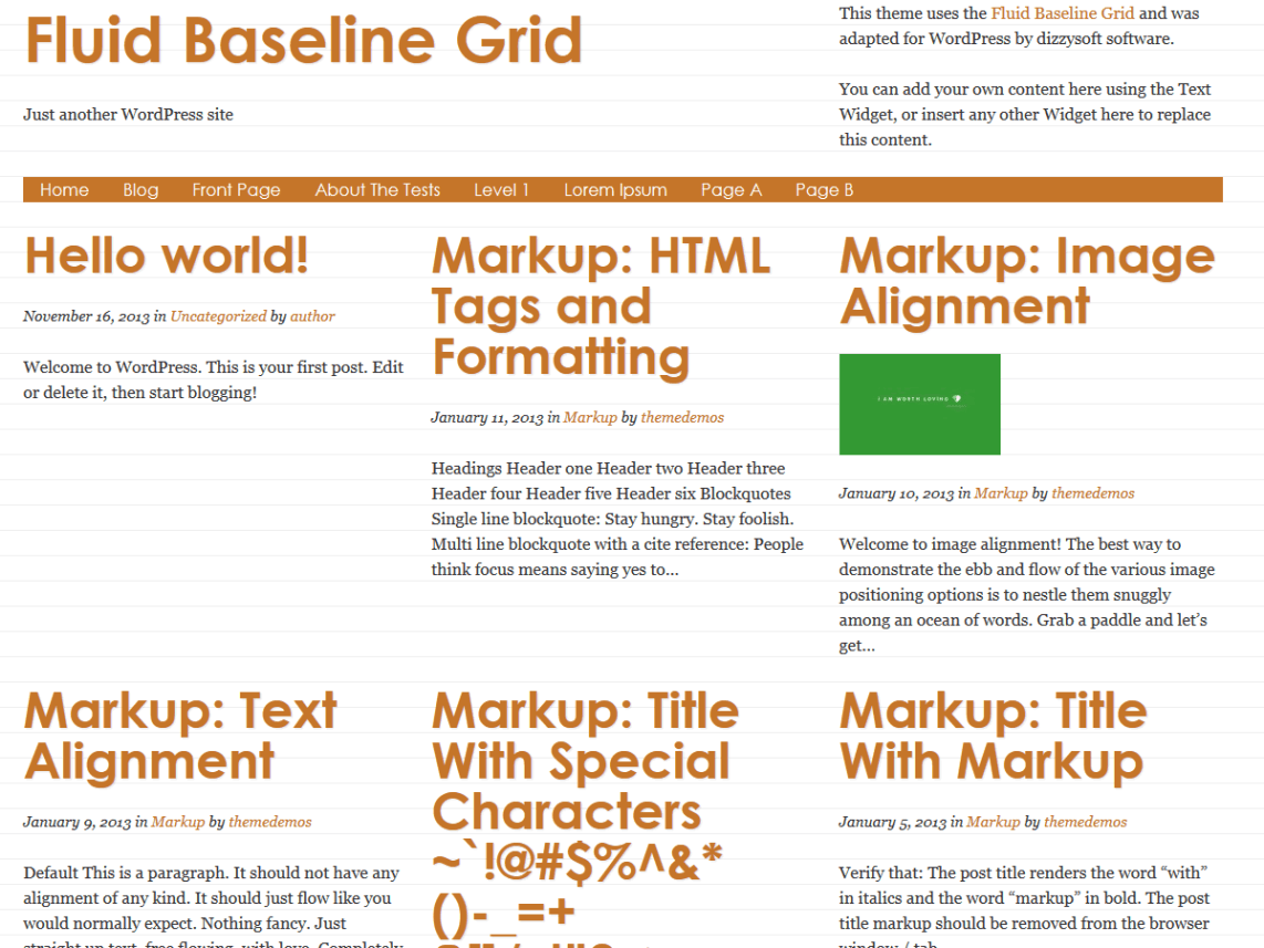
This theme is fundamentally about words. It’s designed using the best-practices of typography for easier reading. This is especially important in a world where mobile is an important part of any blog’s traffic. Speaking of which, this is designed from a mobile-first perspective. This means it is not only responsive but designed to provide maximum readability for mobile users across devices. It even handles images and embedded objects (i.e.: videos) in a mobile-friendly way. It is also built for maximum consistency across different browsers- using Respond.js (to allow older browsers to be responsive) and Normalize.css (so it should display consistently across Google Chrome, Mozilla Firefox 4+, Apple Safari 5+, Opera 12+, and Internet Explorer 8+). All these benefits come thanks to Josh Hopkins’s Fluid Baseline Grid, from which this theme receives its name. In addition, the theme includes a couple SEO enhancements to cut-down on duplicated content and more clearly declare the intent of a particular page (including Schema.org markup for Blog posts as Articles). WordPress features it supports: menus (including a responsive menu for small screens), widgets, custom background image and colors, and featured images per post. You can also optionally add widgets to a sidebar of a post or page for a two-column look (without widgets, they will be displayed as one-column).

